Carlisle’s reality—museum-grade craft, rare materials, and obsessive finishing—was being undercut by an identity that visually and verbally echoed commodity retailers. That proximity invited the wrong comparisons and attracted the wrong leads.
Our objective was to reposition Carlisle as the reference point for luxury flooring—a brand that signals craft lineage at every touch—so architecture and design partners can confidently spec it, homeowners aspire to it, and the business can expand into new high-end markets and scale without eroding margin.
Positioning & Narrative: We centered the brand on provenance, not parity—a promise grounded in the statistic that <0.1% of U.S. lumber meets Carlisle’s standard, turning scarcity and stewardship into value drivers.
Verbal Identity: Crafted a language system that speaks like a maker, not a marketer—from features to rituals (select, steward, finish, live). The copy elevates forester relationships, timber grading, air/kiln drying, and hand-finishing as proof of luxury.
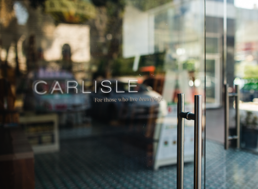
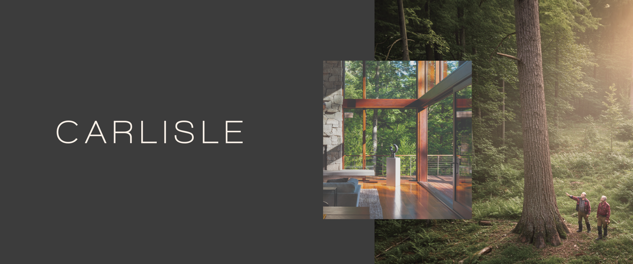
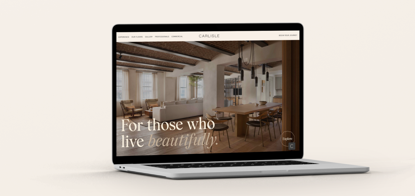
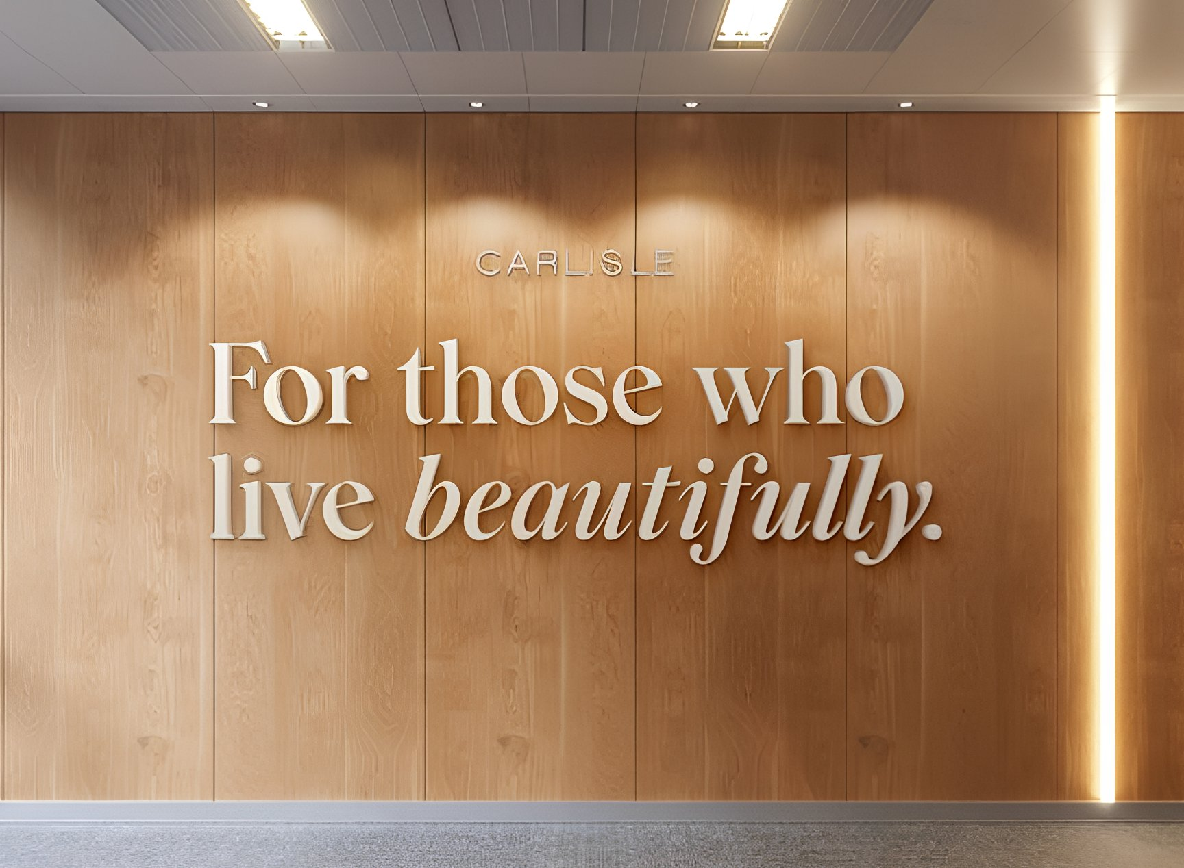
Visual Identity: We introduced editorial restraint and tactile cues—material-led color, refined typography, generous negative space—signaling heritage and confidence instead of promotion.
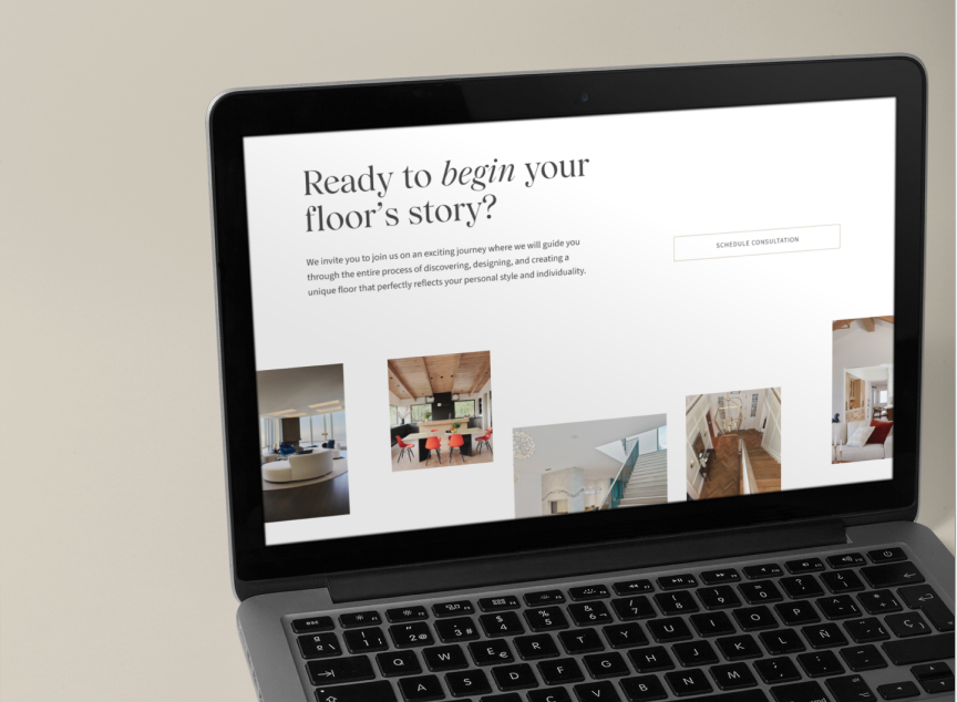
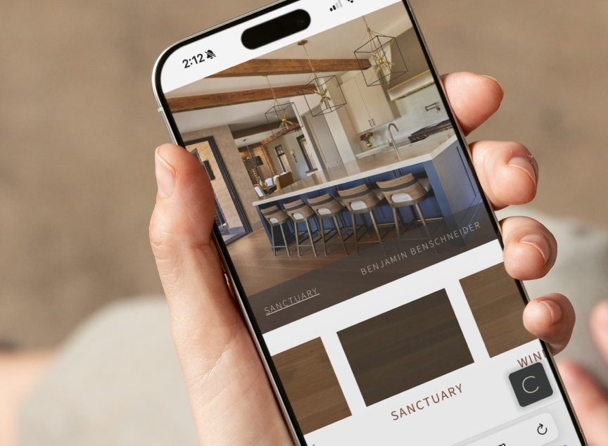
Digital Experience (UX/UI): We rebuilt the site to sell the story before the sample: atelier-style product narratives, pattern and width explainers, finish comparators, and a guided spec flow that maps feelings (warmth, modernity, patina) to constructions and finishes.
Trade Enablement: A&D resource center (spec sheets, CAD/BIM, finish libraries, care guides) + talk tracks that translate craftsmanship into client-ready rationale, helping partners defend premium selections.
Lead Quality Architecture: Content depth, gated tools, and inquiry fields tuned to intent and project context—filtering out price-first shoppers while inviting serious projects and professional specs.
Go-to-Market: Launch narrative and asset suite for PR and sales, dealer guidelines to keep every channel on-brand.
People shopping luxury aren’t buying wood; they’re buying the assurance that someone cared more than they ever could. That care shows up in silence underfoot, in the way light moves across grain, and in how a floor endures a life fully lived.
But, when a brand built on mastery looks like a brand built on mass, price becomes the only story—and the wrong audience listens.
So we reframed Carlisle around craft lineage—from forest to finish. We showed, not told: relationships with loggers and foresters, the grade of timber demanded, the slow patience of drying, and the hand of the finisher. The <0.1% stat became a north star and a filter: if it isn’t rare, it isn’t Carlisle.
Now, on site, visitors start with intention—what they want to feel and how they plan to live—then arrive at configurations that carry those values. Designers find what they need to spec fast; homeowners discover why construction choices (not just colors) are the true luxury. Every page replaces comparison shopping with conviction building.
Finally, the brand starts to match the product. Carlisle no longer competes for attention; it commands it. A&D partners stop selling a “nice floor” and start presenting a heritage choice that elevates their own practice. The business is now positioned to scale without dilution, to enter new markets without lowering the bar, to grow by deepening desire rather than discounting it.
Homeowners feel the difference, too. The photography lingers on grain the way you linger on a memory. The copy breathes—verbs like select, steward, restore, endure—because a floor isn’t scenery; it’s a surface for a life. The inquiry form doesn’t gatekeep; it clarifies intent. Price-first browsers slip away. Project-ready clients lean in.
Designers find a different kind of help. Instead of apologizing for premium, the brand arms them to defend it—spec sheets that tie construction to performance in the real world, finish libraries that read like a maker’s palette, language that persuades clients without performing. The conversation shifts from, “How much per square foot?” to “Which pattern best carries this space—and why?”.
Luxury was never just finish. It was the Carlisle standard all along. The rebrand simply made it visible.